How America gets its power: 1882 to 2026, and where it’s heading
By Brendan Faulds, founder · Updated July 4, 2026 · 11 min read · Independent, no sales pitch
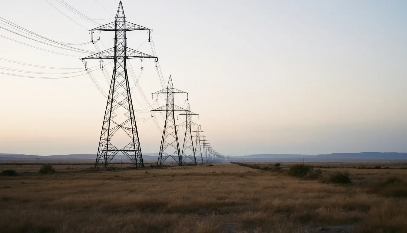
On 4 September 1882, Thomas Edison threw a switch at Pearl Street Station in lower Manhattan and lit about 400 lamps for 85 customers. A century and a half later the system that grew from that basement dynamo generates around 4,400 terawatt-hours a year — and it is changing faster right now than at any point in fifty years. This is the story of how America's power got made, decade by decade, and an honest look at where it's heading — because almost everything this site calculates, from solar payback to what an EV costs to charge, ultimately rides on it.
1882–1935: the current wars, and electricity as a luxury
Edison's Pearl Street ran on direct current, which couldn't travel more than a mile or so — fine for dense Manhattan blocks, useless for a continent. George Westinghouse and Nikola Tesla bet instead on alternating current, which transformers could step up to high voltage and send long distances. The "war of the currents" ended decisively in 1896 when AC from the new Niagara Falls plant reached Buffalo, 20 miles away. From then on the pattern was set: big central plants, long wires, and utilities that grew into some of the largest corporations in the country. By the 1920s electricity had reached most American cities — but only about one farm in ten. If you lived rural, you lit with kerosene and pumped water by hand.
1935–1970: everyone gets the grid
The Rural Electrification Administration (1935) and the Tennessee Valley Authority (1933) changed that, financing farmer-owned co-operatives to string wire where investor-owned utilities wouldn't. Within twenty years rural America was electrified — many of those co-ops still serve the same territory today, which is why several of our state pages note that your solar terms depend on whether a co-op or a big utility serves your address. Demand roughly doubled every decade: refrigerators, then air conditioning, then everything else. Generation grew from about 334 TWh in 1950 to more than ten times that by century's end.
Source: EIA Monthly Energy Review, Table 7.2a · utility-scale; rooftop solar excluded · 2025 preliminary
Reading the bands: coal's long reign
The chart above is the whole story in one picture. Start at the left: in 1950, coal made 46.2% of US electricity and — easy to forget now — hydro made 30.2%. The great federal dams of the 1930s and 40s (Hoover, Grand Coulee, the TVA system) were the renewable era before the renewable era. But rivers don't scale with demand, so as consumption exploded, coal filled the gap. Its share stayed near or above half for four straight decades, peaking at about 57% in 1988. Oil came and went — it carried over 10% in the early 1970s, then the oil shocks priced it out of power generation almost entirely (it's 0.4% today).
1957–1990: the nuclear wave
The first commercial nuclear plant, Shippingport in Pennsylvania, came online in 1957–58. Orders boomed through the 1960s and 70s, and nuclear's share climbed from ~1% in 1970 to 19% by 1990. Then it stopped — Three Mile Island (1979) hardened public opinion while construction costs and delays did at least as much damage, and for three decades almost nothing new was built. What's remarkable is the plateau: nuclear held 19–20% of US generation from 1990 through 2020, the quiet workhorse share of the grid, slipping only recently (to 17.7%) because total generation finally started growing again around it.
2005–2020: the shale gas earthquake
For most of the 2000s the mix looked frozen: half coal, a fifth nuclear, gas and hydro filling in. Then fracking made natural gas abruptly cheap, and the fastest fuel switch in the grid's history followed. Gas passed coal for the first full year in 2016, and coal's collapse has been staggering — from about 50% of generation in 2005 to 16.6% in 2025, with roughly 145 GW of coal capacity retired since 2011. Meanwhile wind grew from a rounding error to 10.5%, and solar — essentially zero as recently as 2010 — hit 6.7% at utility scale (nearer 9% once rooftop systems like the ones this site models are counted). Notably, all of this happened while total demand stayed flat: efficiency gains (LEDs, better appliances, offshored industry) cancelled out population growth for fifteen years.
What it costs — the part you feel
For decades, the real (inflation-adjusted) price of residential electricity drifted slowly downward — the grid's quiet gift to household budgets. That era is over. Since 2021 the national average residential rate has risen roughly 30% in nominal terms, from about 13.7¢/kWh to over 18¢, and the EIA expects it to keep outpacing inflation in the near term. Grid upgrades, storm hardening, gas price swings and surging demand all feed it. Here's the recent national trend from the same EIA data that powers every calculator on this site:
United States electricity price trend
Average residential rate, monthly, Jun 2023 – May 2026. Up 15% over the period.
Source: U.S. Energy Information Administration (EIA), Electric Power Monthly · range 15.41–18.83¢/kWh
Where it's heading
After twenty flat years, demand is growing again — and quickly. The EIA projects US consumption up about 1% in 2026 and 3% in 2027, the strongest sustained growth since 2000. The drivers, in rough order:
- Data centers and AI. The big one. Data centers used about 4.7% of US electricity in 2024; Lawrence Berkeley National Laboratory's central estimate has that reaching ~12% by 2030, and credible projections across studies span roughly 9–17%. On some estimates they account for a third of all US demand growth this decade.
- Electrification. EVs charging at home and heat pumps replacing gas furnaces move energy spending from the pump and the gas meter onto the electricity bill — the exact trade-offs our EV and heat pump calculators price for your state.
- New factories. Semiconductor, battery and other manufacturing plants coming online add industrial load the grid hasn't seen in a generation.
What will supply it? The queue tells you what developers are betting on: at the end of 2024 about 2,300 GW of projects were waiting for grid connection — and solar, wind and batteries made up roughly 90% of it, with grid batteries alone growing from ~16 GW installed to ~41 GW in just two years. Gas projects are rising again too, and nuclear is stirring: Vogtle units 3 and 4 in Georgia (2023–24) were the first new reactors in decades, a retired Pennsylvania reactor is being revived for 2027 under a Microsoft power deal, and the first advanced-reactor construction permit was issued in late 2025. Coal retirements, meanwhile, have slowed sharply — only 2.6 GW retired in 2025, the least in fifteen years — because suddenly every megawatt is wanted.
What it means for your bill
Squeeze all the history into one honest sentence: power demand is rising for the first time in a generation, supply is scrambling to keep up, and residential rates are outpacing inflation. Rising rates are the strongest single force in favor of making your own power — every cent your utility adds per kWh shortens a solar payback — while electrified heating and driving raise how much of your bill panels can offset. That's not a sales pitch; cheap-power states still exist and solar still doesn't pay everywhere, as our state pages say plainly. But the direction of travel is one way. See what the numbers say for your state: solar payback, EV charging, or heat pump vs gas.
The mix, decade by decade
| Year | Coal | Oil | Hydro | Natural gas | Nuclear | Wind | Solar | Other |
|---|---|---|---|---|---|---|---|---|
| 1950 | 46.2% | 10.1% | 30.2% | 13.3% | — | — | — | 0.1% |
| 1960 | 53.1% | 6.3% | 19.7% | 20.8% | 0.1% | — | — | — |
| 1970 | 45.9% | 12% | 16.3% | 24.3% | 1.4% | — | — | 0.1% |
| 1980 | 50.7% | 10.7% | 12.2% | 15.1% | 11% | — | — | 0.2% |
| 1990 | 52.5% | 4.2% | 9.6% | 12.3% | 19% | 0.1% | — | 2.2% |
| 2000 | 51.7% | 2.9% | 7.2% | 15.8% | 19.8% | 0.2% | — | 2.2% |
| 2010 | 44.8% | 0.9% | 6.3% | 23.9% | 19.6% | 2.3% | — | 1.9% |
| 2015 | 33.2% | 0.7% | 6.1% | 32.7% | 19.5% | 4.7% | 0.6% | 2.2% |
| 2020 | 19.3% | 0.4% | 7.1% | 40.6% | 19.7% | 8.4% | 2.2% | 1.9% |
| 2025 | 16.6% | 0.4% | 5.6% | 40.8% | 17.7% | 10.5% | 6.7% | 1.5% |
Share of utility-scale net generation. "—" means below 0.05%, not literally zero. 2025 preliminary.
Sources for this page
- EIA Monthly Energy Review, Table 7.2a — generation by source, 1949–present
- EIA — Electricity in the United States (current mix)
- EIA — Use of electricity (demand history)
- EIA — 2026–27 demand growth projections (Jan 2026)
- Lawrence Berkeley National Laboratory — US Data Center Energy Usage Reports (2024 & 2025 update)
- LBNL — Queued Up 2025: the interconnection queue
- EIA — coal retirements slow (2026)
- EIA — battery storage capacity record (2026)